""

June 2023

How Web Design Impacts User Experience and Conversions

In the fast-paced digital world, where attention spans are dwindling, creating a captivating and user-friendly website is vital for businesses seeking to engage visitors, drive conversions, and achieve online success. Web design goes beyond aesthetics; it plays a pivotal role in shaping user experience (UX) and directly impacts conversions. In this article, we will explore the significant ways in which web design influences user experience and ultimately boosts conversions.

FIRST IMPRESSIONS MATTER

First impressions are crucial in every aspect of life, and the online world is no exception. When users land on your website, they quickly form an opinion about your business based on its appearance and overall design. Studies have shown that it takes as little as 50 milliseconds for users to form a judgment about a website’s visual appeal. This means that within the blink of an eye, visitors have already decided whether they find your website trustworthy, credible, and worth their time.

A visually appealing and professional web design establishes credibility and creates a positive perception of your brand. When users encounter a well-designed website, they feel confident that they are dealing with a reputable and trustworthy business. A clean, modern, and aesthetically pleasing design suggests that you pay attention to detail and care about providing a high-quality user experience.

A cluttered or outdated design, on the other hand, can have a detrimental impact on users’ perception of your business. It may give the impression that your business is unprofessional, outdated, or lacking attention to detail. Users may perceive a cluttered design as chaotic and overwhelming, making it difficult for them to find the information they are looking for. This can lead to frustration and prompt them to abandon your website in favour of a competitor’s.

In addition to establishing credibility, a visually appealing design captures users’ attention and encourages them to explore further. A well-thought-out layout, striking imagery, and engaging visuals draw users in, making them more likely to stay on your website and delve deeper into your content. This increased engagement provides an opportunity to showcase your products, services, or valuable information, ultimately leading to conversions.

Remember that a good first impression is not only about visual appeal but also about alignment with your brand identity. Your web design should reflect your brand’s personality, values, and target audience. Consistency in branding elements such as colours, typography, and imagery across your website and other marketing channels reinforces your brand identity and helps users establish a connection with your business.

It’s important to regularly evaluate and update your website’s design to ensure it remains fresh, modern, and aligned with current design trends. Keeping up with design best practices not only enhances the user experience but also conveys that your business is proactive and adaptable.

In conclusion, the first impression your website makes on users has a significant impact on their perception of your business. A visually appealing and professional design establishes credibility, captures users’ attention, and increases the likelihood of them staying and exploring further. By investing in a well-designed website, you can create a positive first impression that sets the stage for a successful user experience and ultimately drives conversions.

""

NAVIGATION AND USER-FRIENDLY INTERFACE

Navigation and user-friendly interface are key elements in providing a positive user experience on your website. Users should be able to navigate through your site effortlessly, find the information they need quickly, and accomplish their goals without confusion or frustration. Here’s an expansion on how navigation and user-friendly interface impact user experience and conversions:

Well-Structured Menu: The main navigation menu should be prominently displayed and clearly organized. It should include relevant categories and subcategories that represent the main sections of your website. A logical and intuitive menu structure allows users to understand the hierarchy of your content and easily navigate to their desired pages.

Clear Labels and Descriptions: Each menu item and link should have concise and descriptive labels that accurately represent the content or functionality it leads to. Users should be able to understand where each link will take them before clicking on it. Avoid using vague or ambiguous labels that can confuse users and lead to frustration.

Search Functionality: Implementing a search feature on your website is crucial, especially if you have a large amount of content. A search bar that is easily visible and accessible allows users to quickly search for specific information, products, or services. Make sure the search results are relevant and well-organized, providing users with options to narrow down their search if needed.

Consistent Layout and Design: Maintain a consistent layout and design throughout your website to provide a cohesive and familiar user experience. Users should easily recognize common design elements such as headers, footers, and navigation bars across different pages. Consistency in design elements contributes to a sense of familiarity and ease of use.

Intuitive User Flows: Consider the typical user journey on your website and ensure that it flows naturally. Users should be guided from one page to another in a logical and intuitive manner. For example, if you have an e-commerce website, the process of adding items to the cart, viewing the cart, and proceeding to checkout should be straightforward and seamless.

Responsive and Mobile-Friendly Design: With the increasing use of mobile devices, it is essential to ensure that your website is responsive and optimized for various screen sizes. Mobile users should have the same level of ease and convenience in navigating your website as desktop users. A mobile-friendly design enhances user experience and prevents frustration caused by distorted layouts or tiny text on smaller screens.

Minimize Clutter and Complexity: Keep the design and layout of your website clean and uncluttered. Avoid overwhelming users with excessive content, ads, or distracting elements. A cluttered interface can confuse and frustrate users, making it difficult for them to focus on the information or actions they are looking for.

User Testing and Feedback: Regularly conduct user testing and gather feedback to identify any pain points or usability issues. Observing how users interact with your website and listening to their feedback can provide valuable insights into areas that may need improvement. Implementing user feedback helps refine the navigation and interface, resulting in a more user-friendly website.

By prioritizing intuitive navigation and a user-friendly interface, you create a positive user experience that encourages visitors to stay on your website, explore further, and complete desired actions. When users can easily find what they’re looking for, they are more likely to engage with your content, products, or services, leading to higher conversion rates and increased customer satisfaction.

""

KEEP MOBILE IN MIND

The use of mobile devices has become ubiquitous. People rely on their smartphones and tablets to browse the internet, shop online, and access information on the go. As a result, ensuring that your website is responsive and optimized for mobile devices is no longer an option but a crucial requirement. Here’s an expansion on the importance of responsiveness and mobile optimization for user experience and conversions:

Widespread Mobile Usage: The statistics speak for themselves. Mobile devices account for a significant portion of internet traffic, with a growing number of users accessing websites through smartphones and tablets. Ignoring the mobile audience means missing out on a substantial potential customer base. By prioritizing mobile optimization, you tap into this vast market and make your website accessible to a wider audience.

Seamless User Experience: Responsive web design ensures that your website adapts and responds to different screen sizes and resolutions. It provides users with a seamless and consistent experience, regardless of the device they are using. A responsive website automatically adjusts its layout, text, images, and interactive elements to fit the screen, eliminating the need for users to zoom in, scroll horizontally, or deal with distorted content. A positive user experience on mobile devices fosters engagement, encourages users to stay longer on your site, and increases the likelihood of conversions.

Improved Accessibility: Mobile optimization goes beyond responsive design. It also considers factors such as touch-friendly navigation, legible fonts, and well-spaced interactive elements. Mobile users typically have different browsing behaviours and needs compared to desktop users. By optimizing your website for mobile, you ensure that it is accessible and user-friendly, allowing visitors to easily navigate, read content, and interact with your site using touch gestures. Enhanced accessibility translates into a more satisfying experience for mobile users, leading to higher engagement and increased conversion rates.

Search Engine Optimization (SEO) Benefits: Search engines, such as Google, prioritize mobile-friendly websites in their search results. Having a responsive and mobile-optimized website improves your chances of ranking higher in search engine results pages (SERPs) for mobile searches. This visibility boost can drive more organic traffic to your website, increasing the opportunities for conversions. Additionally, Google’s mobile-first indexing approach means that the mobile version of your website is considered the primary version for indexing and ranking, further emphasizing the importance of mobile optimization.

Reducing Bounce Rates: A non-mobile-friendly website can frustrate mobile users, leading to high bounce rates. If visitors encounter a poorly optimized site on their mobile devices, they are likely to leave quickly and seek alternatives. High bounce rates signal to search engines that your website may not be providing a satisfactory user experience, potentially impacting your organic rankings. By optimizing your website for mobile, you reduce bounce rates, keep users engaged, and increase the chances of converting them into customers.

Competitive Advantage: Mobile optimization has become a standard practice, particularly for businesses targeting consumers or offering e-commerce solutions. A well-optimized mobile website sets you apart from competitors who have not yet embraced mobile-friendly design. By providing a superior mobile experience, you position your business as modern, customer-focused, and attentive to evolving technology trends. This competitive advantage can influence users’ decisions and contribute to increased conversions and customer loyalty.

In conclusion, responsive web design and mobile optimization are crucial for providing a seamless user experience and maximizing conversions. By adapting your website to different screen sizes and optimizing it for mobile devices, you ensure that users can easily access and engage with your content, leading to higher engagement, lower bounce rates, improved search engine visibility, and increased conversions. Embracing mobile optimization is not just a best practice; it’s a necessity for businesses to thrive in today’s mobile-driven world.

""

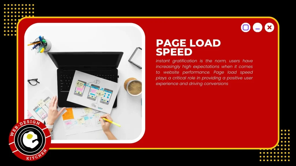
PAGE LOAD SPEED

Instant gratification is the norm, users have increasingly high expectations when it comes to website performance. Page load speed plays a critical role in providing a positive user experience and driving conversions. Let’s explore why optimizing page load speed is essential and how it can impact user experience and conversions:

User Expectations: Users have little patience for slow-loading websites. Research has shown that the majority of users expect a webpage to load within two seconds or less. Any delay beyond that can lead to frustration and prompt users to abandon the site in search of faster alternatives. By optimizing page load speed, you meet user expectations, provide a smooth browsing experience, and retain visitors on your website.

User Experience: Page load speed directly affects user experience. A fast-loading website creates a positive impression and instils confidence in your brand. Users are more likely to engage with your content, explore different pages, and complete desired actions when they experience minimal waiting times. On the other hand, slow-loading pages can create a negative perception of your website, leading to dissatisfaction and a higher likelihood of abandonment.

Decreased Bounce Rates: A slow website can significantly contribute to high bounce rates. When users encounter a page that takes too long to load, they often hit the back button or close the tab, resulting in a lost opportunity for engagement and conversions. Optimizing page load speed helps reduce bounce rates by keeping users engaged and interested in exploring your website further.

Search Engine Rankings: Search engines, like Google, take page load speed into consideration when ranking websites. Slow-loading websites are likely to receive lower rankings in search engine results pages (SERPs) compared to faster-loading websites. Search engines prioritize delivering a positive user experience, and page load speed is one of the factors they assess. By optimizing your website’s load speed, you improve your chances of ranking higher in search results, attracting more organic traffic, and increasing conversion opportunities.

Mobile Experience: Mobile optimization is vital in today’s mobile-centric world. Mobile users often have slower internet connections, making page load speed even more crucial. Mobile users are typically on the go and expect quick access to information. Optimizing your website for fast loading on mobile devices ensures that you cater to this audience, provide a seamless experience, and increase the chances of conversions.

Techniques for Optimization: There are various techniques to optimize page load speed. Image optimization, where images are compressed without sacrificing quality, reduces file sizes and improves load times. Caching techniques store frequently accessed website elements locally, reducing the need for repeated requests to the server. Minimizing code and reducing the number of HTTP requests can also contribute to faster load times. Implementing these optimization techniques enhances user experience, encourages users to stay on your website, and boosts conversion rates.

Competitive Advantage: In a competitive online landscape, a fast-loading website gives you an edge over competitors with slower sites. Users are more likely to choose a website that loads quickly, as it signifies efficiency, professionalism, and attention to user needs. By prioritizing page load speed optimization, you provide a superior experience that differentiates your business and enhances your chances of outperforming competitors in terms of user engagement and conversions.

In conclusion, optimizing page load speed is crucial for providing a positive user experience and driving conversions. By meeting user expectations, reducing bounce rates, improving search engine rankings, catering to mobile users, and implementing optimization techniques, you create a fast and responsive website that encourages users to stay, engage with your content, and ultimately convert. Prioritizing page load speed is a strategic investment that can significantly impact your online success.

""

VISUAL HIERARCHY

Visual hierarchy and content organization are essential components of an effective web design that contribute to a seamless user experience and drive conversions. By strategically prioritizing and presenting information, you can guide users’ attention, enhance readability, and optimize engagement. Let’s delve deeper into the significance of visual hierarchy and content organization:

Guiding Attention: Visual hierarchy involves using design elements such as size, colour, contrast, and positioning to prioritize and draw attention to specific elements on a webpage. By employing a well-defined visual hierarchy, you can guide users’ attention towards the most important content, such as headlines, key messages, and call-to-action buttons. This helps users quickly understand the structure of the page and locate the information they are seeking, improving their overall browsing experience.

Clear Headings and Subheadings: Using clear and descriptive headings and subheadings helps users navigate through your content and comprehend the information more easily. Headings provide a quick overview and allow users to scan the page for relevant sections of interest. By breaking down content into logical sections, you create a sense of organization and improve the readability of your website. This approach enables users to locate specific information quickly, which can positively impact engagement and conversions.

Visually Distinct Call-to-Action Buttons: Call-to-action (CTA) buttons play a crucial role in driving conversions. To make CTAs effective, they should stand out from other page elements and clearly communicate the desired action. By using contrasting colours, different shapes, or larger sizes, you can create visual distinction and ensure that CTAs catch users’ attention. Placing CTAs strategically within the visual hierarchy, such as near important content or at the end of engaging sections, can further encourage users to take the desired actions, whether it’s making a purchase, subscribing to a newsletter, or requesting a quote.

Readability and Comprehension: A well-organized content layout enhances readability and comprehension, making it easier for users to consume information. Use consistent typography, appropriate font sizes, and ample white space to create a visually appealing and readable content structure. Break up long paragraphs into shorter ones, use bullet points or numbered lists to highlight key points, and employ relevant visuals such as images or icons to complement the text. Organized and scannable content allows users to grasp the main ideas quickly and encourages them to explore further, increasing the likelihood of conversions.

User-Focused Information Architecture: The organization and structure of your website’s content should align with users’ expectations and mental models. By considering how users think and search for information, you can design an intuitive information architecture that facilitates seamless navigation and content discovery. Conduct user research, analyse user behavior, and incorporate user feedback to refine your website’s content organization. A user-centric information architecture ensures that users can find what they need efficiently and helps them feel more engaged and satisfied with their experience on your website.

Responsive Design for Content Presentation: With the rise of mobile browsing, it’s crucial to ensure that your content is presented effectively across different screen sizes. Responsive design allows your website to adapt dynamically to various devices, preserving the visual hierarchy and content organization. This ensures that users have a consistent and optimized experience, regardless of whether they’re browsing on a desktop, tablet, or smartphone. A responsive design not only enhances usability but also contributes to better engagement and higher conversion rates.

By incorporating visual hierarchy and implementing a well-organized content structure, you create a user-friendly website that engages visitors and encourages them to take the desired actions. Effective content organization enhances readability, comprehension, and navigation, allowing users to quickly find the information they seek and interact with your CTAs. Ultimately, this attention to visual hierarchy and content organization helps drive conversions and contributes to the overall success of your website.

""

CONSISTENT BRANDING AND MESSAGING

Consistent branding and messaging play a crucial role in web design as they reinforce your brand’s identity, create a memorable user experience, and ultimately drive conversions. Here’s an expansion on the importance of consistent branding and messaging:

Establishing Brand Identity: Web design allows you to visually represent your brand and establish a distinctive identity. Consistent branding elements, such as your logo, colour schemes, typography, and imagery, create a cohesive look and feel across your website. This visual consistency helps users recognize and remember your brand, reinforcing its presence in their minds. When your website design aligns with your offline branding efforts, it strengthens brand recognition and recall, enhancing trust and familiarity with your business.

Conveying a Unique Value Proposition: Your web design is an opportunity to communicate your unique value proposition and differentiate yourself from competitors. Consistent branding elements, combined with compelling messaging, allow you to clearly articulate what sets your business apart. By aligning your design elements with your brand’s messaging, you create a cohesive and impactful presentation of your value proposition, capturing users’ attention and driving their interest in your products or services.

Building Trust and Recognition: Consistency in branding and messaging fosters trust and credibility. When users encounter a website that has consistent branding elements and a cohesive message, they perceive it as more professional, reliable, and trustworthy. Inconsistent or conflicting design elements, on the other hand, can confuse users and erode trust. By presenting a consistent brand image and messaging, you build a solid foundation of trust and recognition, encouraging users to engage with your website and increasing the likelihood of conversions.

Enhancing User Experience: Consistent branding and messaging contribute to a seamless and user-friendly experience. When users navigate through your website, they should encounter a consistent visual language and messaging that guides them intuitively. This consistency helps users understand your website’s structure, locate relevant information easily, and navigate through different pages effortlessly. A positive user experience leads to increased engagement, as users spend more time on your website, explore its features, and interact with your conversion-focused elements.

Connecting Emotionally with Users: Consistent branding and messaging enable you to connect with users on an emotional level. When your website design aligns with your brand’s personality and values, it creates a cohesive and authentic experience. By evoking emotions that resonate with your target audience, such as trust, excitement, or reliability, you establish a deeper connection with users. Emotional connections increase the likelihood of conversions as users develop a sense of affinity and loyalty towards your brand.

Reinforcing Multi-Channel Marketing Efforts: Your website is often just one touchpoint in a broader marketing ecosystem. Consistent branding and messaging across different marketing channels, such as social media, email campaigns, and print materials, reinforce your brand’s identity and value proposition. When users encounter consistent branding across various channels, it strengthens their recognition and reinforces your messaging. This multi-channel consistency creates a unified and impactful brand experience, driving conversions as users move seamlessly between different touchpoints and engage with your marketing efforts.

In conclusion, consistent branding and messaging in web design are essential for reinforcing your brand’s identity, conveying your unique value proposition, and driving conversions. By maintaining visual consistency, aligning design elements with your brand’s messaging, and providing a cohesive user experience, you establish trust, build recognition, and connect emotionally with users. These elements collectively contribute to increased engagement and conversions, as users feel more confident in your brand and are more likely to take the desired actions on your website.
""

CONVERSION FOCUSED DESIGN ELEMENTS

Conversion-focused design elements are essential for maximizing the effectiveness of your website in driving user actions and achieving your business goals. By strategically placing attention-grabbing elements and optimizing the user journey, you can create a web design that encourages conversions. Let’s explore the importance of conversion-focused design elements in more detail:

Call-to-Action (CTA) Buttons: CTAs are crucial design elements that prompt users to take specific actions. Whether it’s “Buy Now,” “Sign Up,” or “Contact Us,” well-designed and prominently placed CTAs grab users’ attention and guide them towards the desired conversion. The design of your CTA buttons should include contrasting colours, clear and concise copy, and an easily identifiable clickable area. By making your CTAs visually distinct and persuasive, you increase the likelihood of users clicking on them and completing the desired actions.

Persuasive Headlines and Copy: Compelling headlines and persuasive copy are essential in capturing users’ attention, conveying your value proposition, and motivating them to take action. Use persuasive language that emphasizes the benefits users will gain by engaging with your products or services. Incorporate clear and concise messaging that aligns with your brand’s voice and resonates with your target audience. A well-crafted headline can entice users to explore further and increase the chances of conversion.

Compelling Visuals: Visual elements, such as images, videos, and infographics, can significantly impact user engagement and conversions. High-quality and relevant visuals enhance the overall user experience, capture attention, and communicate your brand’s message effectively. Use visuals strategically to support your content, demonstrate product features, or convey emotions that align with your desired user actions. A visually appealing website creates a positive impression, increasing users’ trust and willingness to convert.

Clear Information Hierarchy: A well-designed website organizes information in a logical and intuitive manner. Users should be able to quickly scan and understand the content hierarchy, leading them towards the desired conversion actions. Prioritize important information, such as pricing, key features, or testimonials, and present it prominently. Use visual cues, such as headings, subheadings, bullet points, and icons, to guide users’ attention and create a clear and scannable content structure. A clear information hierarchy reduces cognitive load and helps users make informed decisions, increasing the likelihood of conversions.

Streamlined Conversion Funnel: A conversion-focused design optimizes the user journey and streamlines the conversion process. Analyse your conversion funnel and identify any potential barriers or friction points that may hinder user progress. Simplify form fields, reduce the number of steps required to complete a conversion, and ensure that error messages are clear and user-friendly. Implement progress indicators and provide reassurance at critical points in the conversion process to instil confidence in users. A well-designed conversion funnel improves user experience, reduces abandonment rates, and increases conversion rates.

A/B Testing and Iterative Improvements: Implementing conversion-focused design elements should be an iterative process. Continuously monitor user behavior, track conversion rates, and conduct A/B testing to optimize your design elements. Test different variations of CTAs, headlines, visuals, and overall layout to identify what resonates best with your target audience. By analysing data and making data-driven design decisions, you can iteratively improve your website’s conversion rates over time.

In summary, incorporating conversion-focused design elements in your web design is essential for optimizing user experience and increasing conversion rates. By strategically placing attention-grabbing CTAs, crafting persuasive headlines and copy, utilizing compelling visuals, creating a clear information hierarchy, and streamlining the conversion funnel, you guide users towards desired actions and maximize conversion opportunities. Continuously monitor and refine your design elements through A/B testing and iterative improvements to drive continuous growth in your conversion rates.

""

TRUST AND CREDIBIITY

Trust and credibility are essential factors in driving conversions on your website. Users need to feel confident that they can trust your business, and web design elements play a crucial role in establishing and reinforcing that trust. Let’s expand on how specific design elements contribute to building trust and credibility:

Clear Contact Information: Displaying clear and easily accessible contact information, such as a phone number, email address, or physical address, instils confidence in users. It demonstrates transparency and accessibility, assuring users that they can reach out to your business if they have any questions or concerns. Additionally, including links to your social media profiles and displaying customer support information further enhances the perception of trustworthiness.

Security Badges and SSL Certificates: In today’s digital landscape, online security is a major concern for users. Displaying security badges and SSL certificates on your website signals that you prioritize the security of user data and transactions. These visual indicators provide reassurance that sensitive information is protected and encrypted. When users see these trust symbols, they are more likely to feel safe engaging with your website and sharing their personal information, leading to increased conversions.

Customer Testimonials and Reviews: Genuine customer testimonials and reviews serve as social proof and reinforce the credibility of your business. By featuring positive feedback from satisfied customers, you showcase real experiences and build trust with potential customers. Incorporate visually appealing testimonials throughout your website, including on landing pages and product/service pages, to highlight the positive experiences of others and provide validation for potential customers.

Professional Design and Branding: A professional and visually appealing web design helps establish credibility and trust. A well-designed website with a cohesive brand identity conveys that your business is reputable, reliable, and pays attention to detail. Invest in high-quality graphics, imagery, and typography that align with your brand’s image and target audience. Consistent branding elements, as mentioned earlier, create a polished and professional look, reinforcing trust and encouraging conversions.

Easy-to-Understand Policies: Transparency is key to building trust with your website visitors. Clearly communicate your privacy policy, terms and conditions, refund policies, and any other relevant policies. Make sure they are easily accessible, preferably through a visible link in your website footer or during the checkout process. Clearly outlining your policies shows users that you prioritize their rights and interests, which fosters trust and minimizes potential concerns or doubts.

Responsive Customer Support: Providing responsive and accessible customer support options further enhances trust. Display contact information for customer support, such as a phone number or live chat, prominently on your website. Ensure that your customer support channels are staffed with knowledgeable and responsive team members who can address customer inquiries promptly. Being readily available to assist users builds confidence in your business and encourages conversions by alleviating any concerns or uncertainties they may have.

By incorporating these trust-building design elements, you create an environment that instils confidence in users and encourages them to convert. Trust and credibility are crucial for establishing a positive user experience and building long-term relationships with your customers. When users feel confident in your business’s reliability and trustworthiness, they are more likely to complete transactions, submit inquiries, or engage with your website, ultimately driving conversions.

CONCLUSION

In conclusion, optimizing page load speed is crucial for providing a positive user experience and driving conversions. By meeting user expectations, reducing bounce rates, improving search engine rankings, catering to mobile users, and implementing optimization techniques, you create a fast and responsive website that encourages users to stay, engage with your content, and ultimately convert. Prioritizing page load speed is a strategic investment that can significantly impact your online success.